viewof params2d = Inputs.form({
rows: Inputs.range([2, 6], {value: 4, step: 1, label: "Rows"}),
cols: Inputs.range([2, 6], {value: 5, step: 1, label: "Columns"}),
selRow: Inputs.range([0, 5], {value: 0, step: 1, label: "Highlight row index"}),
selCol: Inputs.range([0, 5], {value: 0, step: 1, label: "Highlight column index"}),
op: Inputs.select(
["None", "Sum axis 0 (collapse rows)", "Sum axis 1 (collapse columns)", "Transpose"],
{label: "Operation"}
),
seed: Inputs.range([1, 99], {value: 42, step: 1, label: "Random seed"})
})1 Introduction to Numpy Arrays
1.1 Introduction
Arrays are the fundamental data structures in modern scientific computing, machine learning, and data analysis. In the context of NumPy — the library we focus on in this chapter — we work with arrays: multi-dimensional containers for numerical data, generalizations of scalars, vectors, and matrices to higher dimensions.
When you later work with PyTorch, you will encounter the term tensor. While both NumPy arrays and PyTorch tensors represent multi-dimensional numerical data, they differ meaningfully as data structures. NumPy arrays are CPU-resident, contiguous memory buffers with no built-in support for automatic differentiation or GPU acceleration. PyTorch tensors, by contrast, can reside on CPU or GPU memory, carry gradient information for backpropagation, and participate in a computational graph. These are genuinely different objects under the hood — sharing a conceptual shape but not an implementation. For now, we focus exclusively on NumPy arrays as they form the practical and conceptual foundation for array-based computation in Python.
This guide introduces NumPy arrays systematically, from one-dimensional arrays (vectors) through three-dimensional arrays commonly used in image processing. Each section builds upon previous concepts while introducing new operations and techniques relevant to that dimensionality.
Throughout this chapter, we emphasize understanding array shapes, dimensions, and the critical concept of axis-based operations. We also introduce four-dimensional arrays here, and in later chapters we build on this foundation to perform visualization and computations on these arrays — techniques that translate directly into image processing applications.
NoteAbout the
# @needs: comments in code cells
Some code cells in this chapter begin with a comment like # @needs: imports or # @needs: define-T1. These are dependency hints — they tell the interactive system which earlier cell must be run first for this one to work.
If you click Run Code on a cell whose dependency hasn’t been run yet, you will see a yellow warning banner instead of an error. The banner names the missing cell and asks you to scroll up and run it first. This is intentional: the chapter is designed to be read top-to-bottom, and each section builds on the variables and imports defined above it.
You can safely ignore these comments when reading the code — they have no effect on what the Python code does.
1.2 One-Dimensional Arrays (Vectors)
1.2.1 Fundamental Concepts
Before working with arrays, we must import NumPy, the fundamental package for numerical computing in Python. By convention, NumPy is imported with the alias np:
NumPy arrays are specialized data structures optimized for numerical operations. They differ fundamentally from Python’s built-in data structures:
| Feature | Python List | NumPy Array |
|---|---|---|
| Type homogeneity | Can mix types | All elements same type |
| Memory efficiency | Less efficient | Highly efficient, contiguous |
| Performance | Slower for math | Vectorized, 10-100× faster |
| Mathematical ops | Requires loops | Native element-wise operations |
| Dimensions | Nested lists only | True multi-dimensional |
While NumPy arrays are our focus, it’s important to note that other frameworks provide their own array-like structures. TensorFlow offers tf.Tensor objects with additional capabilities for automatic differentiation and GPU acceleration. PyTorch provides torch.Tensor with similar features. These frameworks build upon concepts we’ll learn here, but we focus exclusively on NumPy arrays as they form the foundation for understanding all array operations in Python.
A one-dimensional array, commonly called a vector, is the simplest non-scalar array structure. It represents an ordered sequence of values, each identified by a single index. In NumPy, we create vectors using the array() function:
Figure 1.1: One-dimensional array visualization showing three elements along a single axis
Every NumPy array has several key attributes that describe its structure. The shape attribute returns a tuple indicating the dimensions—for a vector with 5 elements, this would be (5,). The ndim attribute tells us the number of dimensions (1 for a vector), while size gives the total number of elements:
Quiz: Fundamental Concepts
What attribute would you use to find the number of dimensions in a NumPy array T1?
1.2.2 Indexing and Slicing
Vector elements are accessed using zero-based indexing. Python’s negative indexing allows access from the end of the array, where -1 refers to the last element. Slicing creates views into the array using the syntax [start:stop], where the stop index is exclusive:
Quiz: Indexing and Slicing
Given T1 = np.array([10, 20, 30, 40, 50]), what does T1[1:4] return?
Code Challenge Quiz: 1D Slicing
T1 is already defined as [10, 20, 30, 40, 50]. Write a slice expression to print only the middle three elements so the output is exactly:
[20 30 40]When you’re done, click Run Code to check your answer.
1.2.3 Vectorized Operations
NumPy’s power lies in vectorized operations—computations applied element-wise to entire arrays without explicit loops. Arithmetic operations between vectors of the same shape work element-wise:
Scalar operations broadcast the scalar to each element. The dot product, a fundamental operation in linear algebra, computes the sum of element-wise products:
Quiz: Vectorized Operations
What is the result of np.array([1, 2, 3]) * 2?
1.2.4 Aggregation Functions
Aggregation functions reduce vectors to scalar values. Common operations include sum, mean, standard deviation, minimum, and maximum. These form the basis for statistical analysis:
Quiz: Aggregation Functions
Given T1 = np.array([2, 4, 6, 8]), what is np.mean(T1)?
Code Challenge Quiz: 1D Statistics
T1 is already defined as [2, 4, 6, 8, 10]. Use a single print() call to display the sum and the maximum separated by a space, so the output is exactly:
30 10Hint: print(a, b) prints both values with a space between them.
When you’re done, click Run Code to check your answer.
1.2.5 Visualizing One-Dimensional Arrays
Effective visualization transforms numerical data into visual patterns that reveal insights invisible in raw numbers. For one-dimensional arrays, several visualization techniques exist, each suited to different analytical purposes. This section explores seven fundamental visualization types and provides guidance on selecting the appropriate method for your data.
Throughout these examples, we’ll use a common dataset representing normalized measurement values:
Line Plots
Line plots connect consecutive data points with lines, making them ideal for time series or sequential data where the order matters. The continuous line emphasizes trends and patterns over the sequence:
Code explanation: The plot() function creates the line connecting data points. The marker='o' parameter adds circular markers at each data point, making individual values visible. linewidth=2 sets the line thickness to 2 points, and markersize=6 controls the size of the circular markers. The grid(True, alpha=0.3) call adds a subtle grid with 30% opacity to help read values accurately.
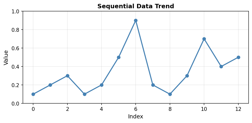
Figure 1.1.5.1: Line plot showing the data trend. Notice the peak at index 6 (value=0.9) and the secondary peak at index 10 (value=0.7). The connecting lines reveal the overall pattern of variation in the measurements.
When to use: Time series data, sequential measurements, data where order and continuity matter. Line plots excel at showing trends, cycles, and rate of change over the sequence.
Scatter Plots
Scatter plots display individual data points without connecting lines. This emphasizes the discrete nature of measurements and makes it easier to identify outliers or unusual values. Each point represents a single measurement, with no assumption of continuity between adjacent values:
Code explanation: The scatter() function plots points without connecting them. range(len(a)) creates x-coordinates [0, 1, 2, …, 12] corresponding to array indices. s=80 sets the marker size in points squared (larger than typical line plot markers), and alpha=0.7 makes markers 70% opaque (30% transparent), which helps when points might overlap.
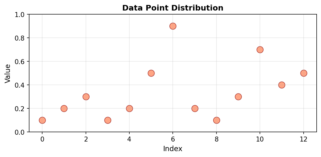
Figure 1.1.5.2: Scatter plot of the same data. Without connecting lines, individual measurements stand out clearly. The maximum value at index 6 (0.9) is easily identified as an outlier compared to most other values which cluster below 0.5.
When to use: Discrete measurements, identifying outliers, comparing individual data points without implying continuity. Scatter plots work well when the relationship between adjacent points is less important than the individual values themselves.
Bar Plots
Bar plots represent each data point as a vertical bar, where the height directly encodes the value. This representation makes magnitude comparisons straightforward, as our visual system easily compares bar heights:
Code explanation: The bar() function creates vertical bars at each index position. edgecolor='black' adds a black border to each bar, making them visually distinct even when adjacent. The bar width is automatically calculated based on the number of bars to fit the available space.
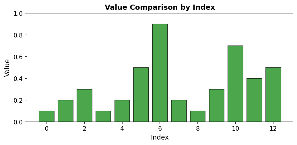
Figure 1.1.5.3: Bar plot emphasizing magnitude differences. The visual “weight” of each bar makes it easy to compare values at a glance. Index 6’s bar (0.9) clearly dominates, while indices 0, 3, and 8 have the shortest bars (0.1).
When to use: Comparing magnitudes across categories or indices, showing discrete values, emphasizing differences between measurements. Bar plots are particularly effective when you have a moderate number of categories (typically fewer than 20) and want to make direct visual comparisons.
Histograms
Unlike previous visualizations that preserve data order, histograms show the distribution of values by grouping them into bins. This transformation reveals patterns in value frequency rather than sequential patterns. Histograms answer questions like “What values are most common?” rather than “When did specific values occur?”
Code explanation: The hist() function automatically groups data into bins and counts occurrences in each bin. bins=5 divides the range [0.1, 0.9] into 5 equal-width intervals. Note that the x-axis now represents value ranges (not indices), and the y-axis shows how many measurements fell within each range.
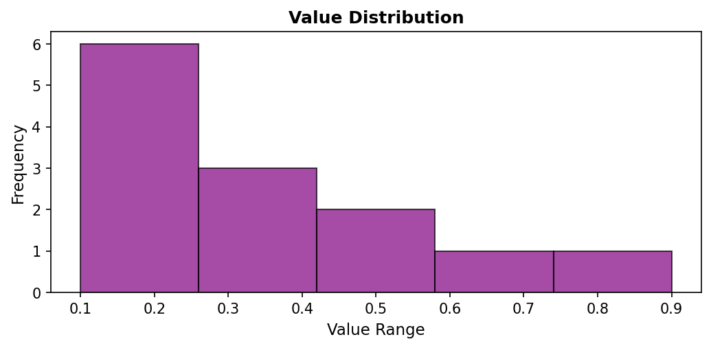
Figure 1.1.5.4: Histogram revealing that most values (6 measurements) fall in the lowest bin (0.1-0.26), with fewer measurements in the mid-range bins, and only 1-2 measurements in the high-value bins. This distribution view shows that low values dominate this dataset.
When to use: Understanding value distribution, identifying common ranges, detecting skewness or multimodal distributions. Histograms are essential when the distribution shape matters more than the sequence. They reveal whether data is clustered or spread out, symmetric or skewed.
Box Plots
Box plots (box-and-whisker plots) provide a compact statistical summary showing the median, quartiles, and potential outliers. They excel at conveying distribution properties in minimal space, making them ideal for comparing multiple datasets side-by-side:
Code explanation: The boxplot() function automatically computes quartiles and identifies outliers. vert=True creates a vertical box plot (horizontal is also possible). The function calculates the median, 25th percentile (Q1), 75th percentile (Q3), and extends whiskers to show the data range.
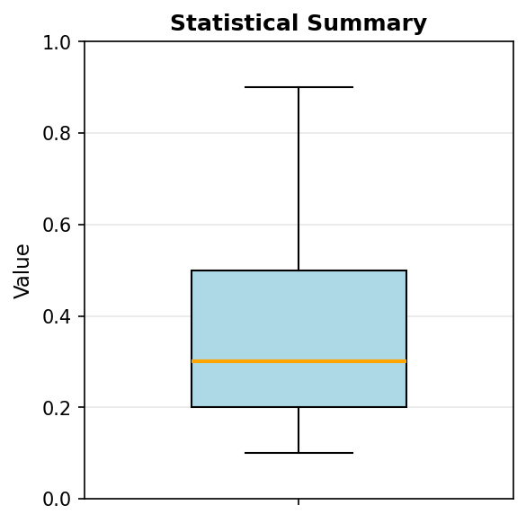
Figure 1.1.5.5: Box plot showing the five-number summary. The box spans from Q1 (~0.2) to Q3 (~0.5), containing the middle 50% of data. The orange line marks the median (~0.3). Whiskers extend to the minimum (0.1) and maximum (0.9), with the maximum potentially marked as an outlier depending on the IQR criterion.
The box represents the interquartile range (IQR) containing the middle 50% of data. The line inside the box marks the median. Whiskers extend to show the range of typical values (usually 1.5 × IQR from the quartiles), while points beyond the whiskers indicate potential outliers. This compact representation conveys: center (median), spread (IQR), skewness (median position), and outliers—all in one plot.
When to use: Comparing distributions across groups, identifying outliers, communicating statistical properties compactly. Box plots are particularly valuable when comparing multiple datasets side-by-side, as they allow quick assessment of differences in center, spread, and shape.
Violin Plots
Violin plots combine box plots with kernel density estimation, showing both statistical summaries and the full distribution shape. The width of the “violin” at each value indicates the estimated probability density, revealing multimodal distributions that box plots might obscure:
Code explanation: The violinplot() function creates a mirrored density plot. showmeans=True adds a marker for the mean, and showmedians=True adds a marker for the median. The violin’s width at any height represents the density of measurements at that value.
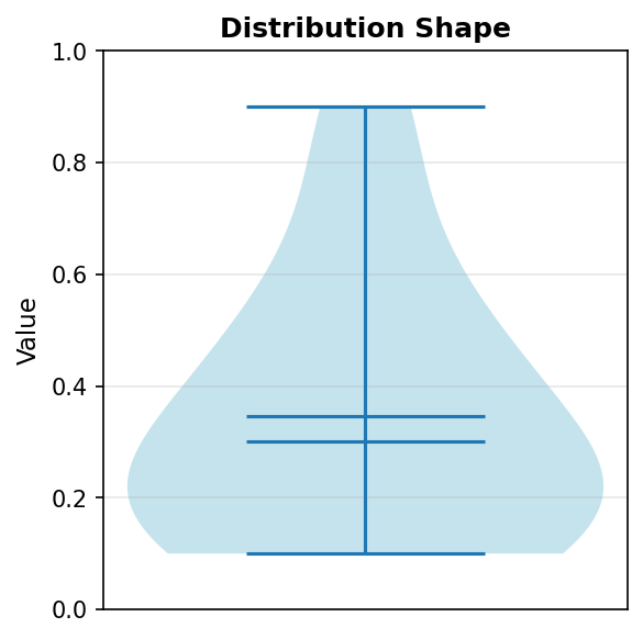
Figure 1.1.5.6: Violin plot revealing the distribution density. The violin is widest in the 0.1-0.3 range, indicating high density of measurements there. The narrow section around 0.6-0.8 shows few measurements in this range. The violin shape reveals information that the box plot summarizes more abstractly.
When to use: When distribution shape matters, especially for detecting bimodality (two peaks) or unusual distributions. Violin plots are most valuable when you have enough data points (typically >20) for the density estimation to be meaningful. They provide richer information than box plots but require more data and more interpretation skill.
Image Representation (imshow)
One-dimensional data can be visualized as a color gradient using the imshow() function. This representation maps values to colors according to a colormap, creating a visual pattern where color intensity represents data magnitude:
Code explanation: The imshow() function expects 2D data, so we wrap our 1D array in brackets: [a] creates a 1×13 array. cmap='viridis' applies the viridis colormap (purple for low values, yellow for high). aspect='auto' adjusts the aspect ratio to fill the figure. The colorbar provides a legend mapping colors to values.
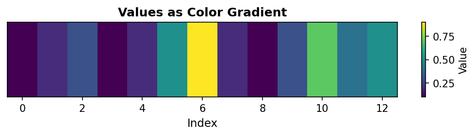
Figure 1.1.5.7: Color gradient representation where yellow indicates high values (0.9 at index 6) and purple indicates low values (0.1 at indices 0, 3, 8). This visualization is particularly useful when 1D data will eventually be combined with 2D data, or when color provides better perceptual discrimination than position.
When to use: Preparing for 2D visualizations, creating publication-quality figures with color encoding, or when working with data that naturally suggests a color scale (temperature, elevation, etc.). Image representation is less common for 1D data but bridges the gap between 1D and 2D visualization techniques.
Choosing the Right Visualization
Selecting the appropriate visualization depends on your analytical goal and data characteristics. Different visualization types emphasize different aspects of the data. This decision guide helps match your question to the best visualization method:
| Your Question | Best Visualization | Key Strength |
|---|---|---|
| How do values change sequentially? | Line plot | Shows trends and patterns |
| How do individual values compare? | Bar plot or scatter | Direct magnitude comparison |
| What’s the distribution of values? | Histogram | Groups values into frequency bins |
| What are the statistical properties? | Box plot | Shows quartiles and outliers |
| What’s the distribution shape? | Violin plot | Reveals density and multimodality |
| Are there unusual outliers? | Scatter or box plot | Individual points clearly visible |
| How do values map to colors? | Image (imshow) | Color encoding of magnitude |
Best Practices for All Visualizations:
- Label axes clearly: Always include units (e.g., ‘Temperature (°F)’, not just ‘Temperature’)
- Provide descriptive titles: Summarize the key insight or data content
- Use gridlines judiciously: They aid reading but shouldn’t dominate the visual
- Choose accessible colors: Consider colorblind-friendly palettes (viridis, plasma)
- Match complexity to audience: Technical audiences may prefer violin/box plots; general audiences often prefer line/bar plots
- Maintain consistent scales: When comparing plots, use the same axis ranges
- Avoid chart junk: Minimize decorative elements that don’t convey information
Remember that the “best” visualization depends on context. A line plot might be perfect for showing a trend but terrible for comparing magnitudes. A histogram reveals distribution but loses all information about order. Always ask: “What question am I trying to answer?” and choose the visualization that best addresses that question.
1.3 Two-Dimensional Arrays (Matrices)
1.3.1 Matrix Structure
Two-dimensional arrays, or matrices, organize data in rows and columns. Each element requires two indices: the first for the row, the second for the column. This structure naturally represents relationships between two sets of features—for example, students (rows) and quiz scores (columns), or pixels arranged in a grid:
Figure 1.3.1.1: Two-dimensional array (matrix) with 3 rows and 3 columns.
The shape (3, 3) indicates 3 rows and 3 columns. Understanding this ordering—rows first, then columns—is critical for all subsequent operations. This convention, sometimes called “row-major” ordering, matches how we read tables and write mathematical matrices.
Quiz: Matrix Structure
What is the shape of a 3×4 matrix in NumPy?
1.3.2 Two-Dimensional Indexing
Matrix indexing extends one-dimensional indexing by requiring two coordinates. We can access individual elements, entire rows, entire columns, or rectangular submatrices using combinations of indices and slices:
The colon notation : selects all indices along that dimension. This powerful syntax allows flexible data extraction without manual iteration. Understanding slice notation is essential: T2[0, :] means “row 0, all columns”, while T2[:, 0] means “all rows, column 0”.
Quiz: Two-Dimensional Indexing
Given a matrix M, what does M[1, 2] access?
Code Challenge Quiz: 2D Column Extraction
T2 is already defined as a 3×3 matrix. Print the second column (column index 1, all rows) so the output is exactly:
[2 5 8]When you’re done, click Run Code to check your answer.
1.3.3 The Concept of Axes: Stack and Collapse
Understanding axes is fundamental to working with multi-dimensional arrays. The most intuitive way to think about axes is through a stack → collapse mental model: an axis represents a direction of stacking, and operations along that axis collapse (or “squash”) data in that direction. The axis you specify in an operation is the axis that disappears.
Throughout this section, we’ll use a simple example matrix:
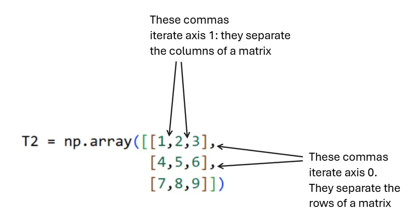
Figure 1.3.3.2: Visual representation of axis structure. Commas between inner brackets separate columns (axis 1), while commas between outer brackets separate rows (axis 0).
Core Principle (Most Important)
An axis is a direction of stacking. Summing over an axis means collapsing (squashing) along that direction.
The axis you specify disappears from the result. This principle applies universally to all reduction operations (sum, mean, max, min, etc.), not just summation.
Axis 0: Rows Are Stacked Vertically
Think of the array as row-sheets stacked on top of each other, going downward. Each row is one “layer” in this vertical stack:
# Visualizing the vertical stack
[1  2  3]   ← Row 0
[4  5  6]   ← Row 1
[7  8  9]   ← Row 2

# These rows are stacked DOWNWARD along axis 0
When we collapse axis 0 using sum(axis=0), we press downward on this stack, combining values that lie on top of each other vertically. The row dimension disappears, leaving only columns:
Interpretation: Axis 0 disappears (rows are gone), axis 1 remains (columns survive). We’ve summed vertically down the columns. Each value in the result represents one column’s total.
Axis 1: Columns Are Stacked Horizontally
Inside each row, values are stacked side-by-side from left to right. This horizontal stacking represents axis 1:
# Visualizing the horizontal stack
[1 | 2 | 3]   ← These values stacked left-to-right
[4 | 5 | 6]   ← These values stacked left-to-right
[7 | 8 | 9]   ← These values stacked left-to-right

# This side-by-side stacking is axis 1
When we collapse axis 1 using sum(axis=1), we squeeze each row from left to right, adding values within each row. The column dimension disappears, leaving only rows:
Interpretation: Axis 1 disappears (columns are gone), axis 0 remains (rows survive). We’ve summed horizontally across the rows. Each value in the result represents one row’s total.
Quick Reference Summary
| Axis | Stacking Direction | What Collapsing Does | Result |
|---|---|---|---|
| 0 | Rows stacked vertically | Adds down columns | Columns remain |
| 1 | Columns stacked horizontally | Adds across rows | Rows remain |
Final Mental Model
Think of a matrix as a structure made of layers:
- Axis 0 → Stack of row-layers → Squash vertically → Columns survive
- Axis 1 → Stack within each row → Squash horizontally → Rows survive
Axis = direction you squash. Result = what survives the squash.
This mental model scales cleanly to 3D arrays and higher-order arrays. For a 3D array with shape (channels, height, width):
- Summing along axis 0 collapses channels → result has shape (height, width)
- Summing along axis 1 collapses height → result has shape (channels, width)
- Summing along axis 2 collapses width → result has shape (channels, height)
The axis you specify always disappears. This consistent rule makes predicting output shapes straightforward across all dimensions.
Quiz: The Concept of Axes
When you sum along axis 0 in a matrix, what happens?
Code Challenge Quiz: 2D Row Sums
T2 is already defined as a 3×3 matrix. Compute and print the sum of each row (sum along axis=1) so the output is exactly:
[ 6 15 24]When you’re done, click Run Code to check your answer.
1.3.4 Matrix Operations
Element-wise operations work identically to vectors—two matrices of the same shape can be added, subtracted, or multiplied element-wise. However, matrix multiplication (the dot product) follows linear algebra rules, where the inner dimensions must match: an (m × n) matrix can multiply an (n × p) matrix to produce an (m × p) result:
The transpose operation .T flips a matrix along its diagonal, exchanging rows and columns. For a matrix of shape (m, n), the transpose has shape (n, m). Transposing is essential for many linear algebra operations and frequently appears in machine learning code:
Quiz: Matrix Operations
What operation computes the element-wise product of two matrices A and B?
1.3.5 Visualizing Two-Dimensional Arrays
Two-dimensional arrays are naturally suited to visual representation, as the two dimensions map directly to the two dimensions of a display. The primary visualization method is the heatmap, which uses color to encode values in a grid:
Single Plot Visualization
Heatmaps use color intensity or hue to represent numerical values in a matrix. Matplotlib’s imshow() function creates heatmaps by treating matrix values as pixel intensities:
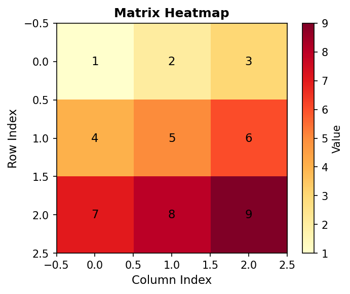
Figure 2.5.1: Heatmap with annotated values showing how color intensity represents magnitude
Multiple Subplots
When comparing matrices or showing different views of the same data, multiple subplots enable side-by-side comparison. Different colormaps can emphasize different features:
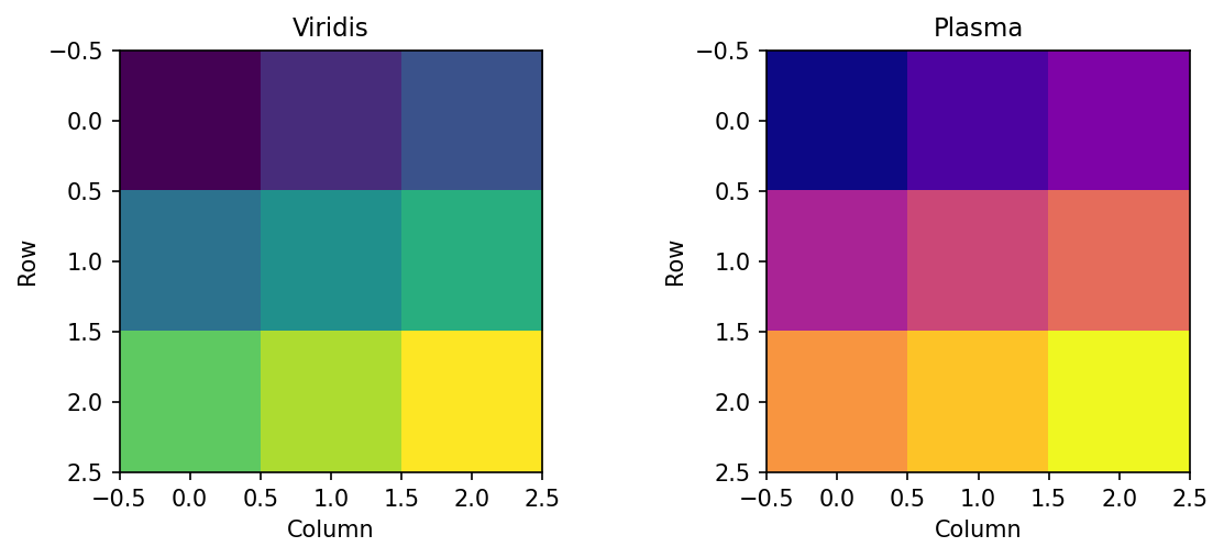
Figure 1.3.5.2.1: Same data with different perceptually uniform colormaps
1.3.6 Interactive: 2D Array Explorer
Use the controls below to explore a two-dimensional array (matrix). Adjust the shape, highlight any element by its row and column index, and apply operations to see how axis-based reductions and transposition change the array.
1.4 Three-Dimensional Arrays
1.4.1 Adding Depth: The Image Representation
Three-dimensional arrays add a third axis, often conceptualized as channels or layers. For RGB images, the standard representation uses shape (channels, height, width), where channels correspond to color components. A typical urothelial cell image has shape (3, 256, 256)—three color channels (red, green, blue) with 256×256 spatial resolution. However, for illustration let’s propose that we have 3 images, each of which is only 8x8 in pixels. Thus, we have the shape (3, 8, 8).
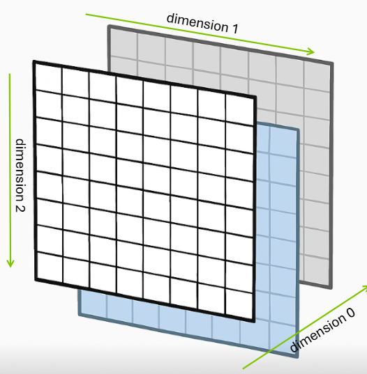
Figure 1.4.1.1: Three-dimensional array showing 8 rows, 8 columns, and 3 layers (depth)
This creates an array with shape (3, 8, 8) where axis 0 represents color channels, axis 1 represents rows (height), and axis 2 represents columns (width). This channel-first convention is common in scientific computing and deep learning frameworks like PyTorch, though some libraries like TensorFlow default to channel-last format (height, width, channels).
Quiz: Three-Dimensional Structure
A color image with 3 channels, 256 rows, and 256 columns has what shape?
1.4.2 Three-Dimensional Indexing
Three-dimensional indexing requires three coordinates: channel (or depth), row, and column. The same slicing principles apply, but now we can extract entire 2D planes, 1D lines, or individual scalars:
Understanding which dimensions are being selected or collapsed is crucial. The notation img[0, :, :] selects channel 0 and all spatial positions, resulting in a 2D array of shape (8, 8). Conversely, img[:, 0, 0] selects all channels at a single spatial position, yielding a 1D array of shape (3,) containing the RGB values at that pixel.
Quiz: Three-Dimensional Indexing
In an array T with shape (3, 4, 5), what does T[1, :, 2] return?
Code Challenge Quiz: 3D Channel Shape
img is already defined with shape (3, 8, 8). Print the shape of the red channel (channel index 0) so the output is exactly:
(8, 8)When you’re done, click Run Code to check your answer.
1.4.3 Building 3D Arrays with np.stack
We just described a 3D array as a stack of channels — here’s the function that builds one that way. np.stack takes a list of arrays and stacks them along a new axis you specify, creating an array with one more dimension than its inputs.
Each channel is a (4, 4) 2D array. Stack them along axis=0 to get a (3, 4, 4) 3D array — 3 channels, each 4×4:
The axis parameter controls where the new dimension is inserted. axis=0 means “insert at the front”, so the number of arrays becomes the first dimension. Changing axis gives you a different shape:
Rule: axis=N inserts the new dimension at position N. The input shapes fill the remaining positions.
Quiz: Building 3D Arrays with np.stack
red, green, and blue are each shape (4, 4). What is the shape of np.stack([red, green, blue], axis=1)?
1.4.4 Operations Across Multiple Axes
Operations can reduce multiple axes simultaneously. Let’s use a small, hand-calculable example to understand how this works.
Creating a 3D Array
We’ll create a (3, 4, 4) array representing 3 channels with 4×4 spatial dimensions:
Structure: - Axis 0: 3 channels (Red, Green, Blue) - Axis 1: 4 rows (height) - Axis 2: 4 columns (width)
Figure 3.3.1: The three channels of T3. Each channel is a 4×4 grid with values chosen to make hand calculations easy.
Sum Along Axis 0 (Collapse Channels)
Summing along axis 0 adds values across all channels at each spatial position:
Output:
[[ 4  4  4  6]
 [10 10 10 10]
 [13  4  7  7]
 [ 8 10 10 13]]
Hand verification at position [0, 0]: - Channel 0: 1 - Channel 1: 2 - Channel 2: 1 - Sum: 1 + 2 + 1 = 4 ✓
Figure 3.3.2: Summing along axis 0 collapses the three channels into a single 4×4 array. Each value is the sum of corresponding pixels across all channels.
Key insight: Axis 0 disappears. Input (3, 4, 4) → Output (4, 4).
Sum Along Axis 1 (Collapse Rows)
Summing along axis 1 adds values down each column within each channel:
Output:
[[19 14 18 22]    ← Channel 0
 [ 6  4  3  4]    ← Channel 1
 [10 10 10 10]]   ← Channel 2
Hand verification for Channel 0, Column 0: - Row 0: 1 - Row 1: 5 - Row 2: 9 - Row 3: 4 - Sum: 1 + 5 + 9 + 4 = 19 ✓
Figure 3.3.3: Summing along axis 1 collapses rows. Red arrows show the sum of each column (adding vertically down all rows).
Key insight: Axis 1 disappears. Input (3, 4, 4) → Output (3, 4).
Sum Along Axis 2 (Collapse Columns)
Summing along axis 2 adds values across each row within each channel:
Output:
[[10 26 15 22]    ← Channel 0
 [ 4  6  4  3]    ← Channel 1
 [ 4  8 12 16]]   ← Channel 2
Hand verification for Channel 0, Row 0: - Columns: 1 + 2 + 3 + 4 = 10 ✓
Figure 3.3.4: Summing along axis 2 collapses columns. Red arrows show the sum of each row (adding horizontally across all columns).
Key insight: Axis 2 disappears. Input (3, 4, 4) → Output (3, 4).
Quiz: Operations Across Multiple Axes
If you sum an array with shape (3, 4, 5) along axis 1, what is the resulting shape?
Summary Table
| Operation | Input Shape | Output Shape | What Disappeared |
|---|---|---|---|
sum(axis=0) |
(3, 4, 4) |
(4, 4) |
Channels (axis 0) |
sum(axis=1) |
(3, 4, 4) |
(3, 4) |
Rows (axis 1) |
sum(axis=2) |
(3, 4, 4) |
(3, 4) |
Columns (axis 2) |
The Rule: The axis you specify disappears from the result.
Multiple Axes
You can collapse multiple axes simultaneously:
Verification: 73 + 17 + 40 = 130 ✓
Other Operations
The same logic applies to all reduction operations:
Key Takeaway: Understanding which axis disappears is fundamental to array operations in NumPy, image processing, and deep learning.
1.4.5 Channel Manipulation
Extracting and modifying individual color channels is common in image processing. Each channel can be processed independently or combined in various ways:
1.4.6 Reshaping and Transposing
Reshaping and transposing are fundamental operations for manipulating array dimensions without changing the underlying data. These operations are essential when interfacing between different libraries, preparing data for algorithms, or reorganizing information for analysis.
The Original Array
We’ll use the same T3 array from Section 1.4.3:
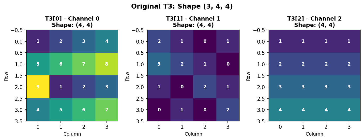
Figure 1.4.5.1: Original T3 with shape (3, 4, 4) - three 4×4 channels.
Understanding Memory Layout
NumPy stores arrays in row-major order (C-style). For our 3D array, elements are stored sequentially: - First: all of Channel 0, row-by-row - Then: all of Channel 1, row-by-row
- Finally: all of Channel 2, row-by-row
This ordering is crucial for understanding how reshape() works.
Flattening to 1D
The flatten() method converts any multi-dimensional array into a 1D vector:
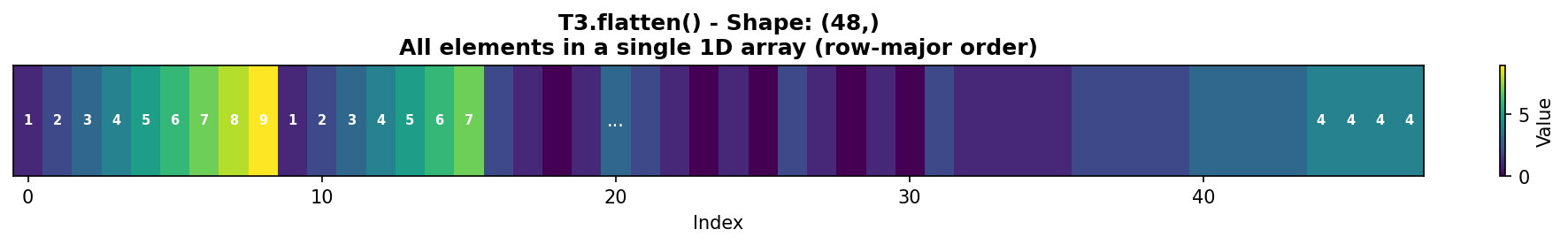
Figure 1.4.5.2: T3.flatten() creates a 1D array with all 48 elements in row-major order. Notice how Channel 0’s first row [1,2,3,4] appears first, followed by its second row [5,6,7,8], and so on.
Key insight: flatten() always creates a copy of the data. For a view instead, use ravel().
Reshaping: Basic Principles
The reshape() method changes array dimensions while preserving element order and count. The total number of elements must remain constant.
Rule: Product of new dimensions must equal total elements. - Original: (3, 4, 4) → 3 × 4 × 4 = 48 elements - Valid reshapes: (48,), (12, 4), (6, 8), (2, 24), (4, 3, 4), etc. - Invalid: (5, 10) → 5 × 10 = 50 ≠ 48 ❌
Reshaping: Merging Axes 0 and 1
Reshape to (12, 4) combines the channel and row dimensions:
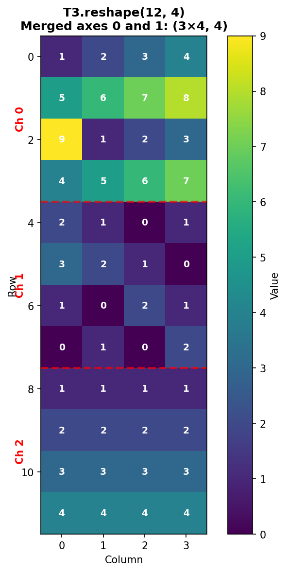
Figure 1.4.5.3: T3.reshape(12, 4) merges axes 0 and 1. The three channels are stacked vertically, with red dashed lines showing channel boundaries. Each channel’s 4 rows appear consecutively.
Verification: - Row 0-3: Channel 0, rows 0-3 - Row 4-7: Channel 1, rows 0-3
- Row 8-11: Channel 2, rows 0-3
Reshaping: Merging Axes 1 and 2
Reshape to (3, 16) combines the spatial dimensions (rows and columns):
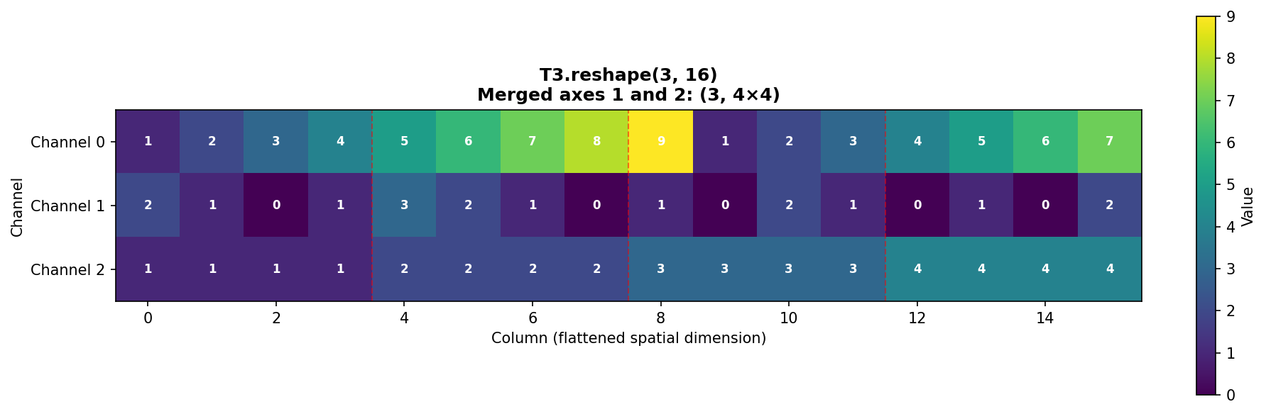
Figure 1.4.5.4: T3.reshape(3, 16) merges spatial dimensions. Each channel’s 4×4 grid is flattened into a 16-element row. Red dashed lines show where original rows end.
Pattern in each channel: - Columns 0-3: Original row 0 - Columns 4-7: Original row 1 - Columns 8-11: Original row 2 - Columns 12-15: Original row 3
Reshaping: Alternative Arrangements
The same 48 elements can be arranged as (4, 12):
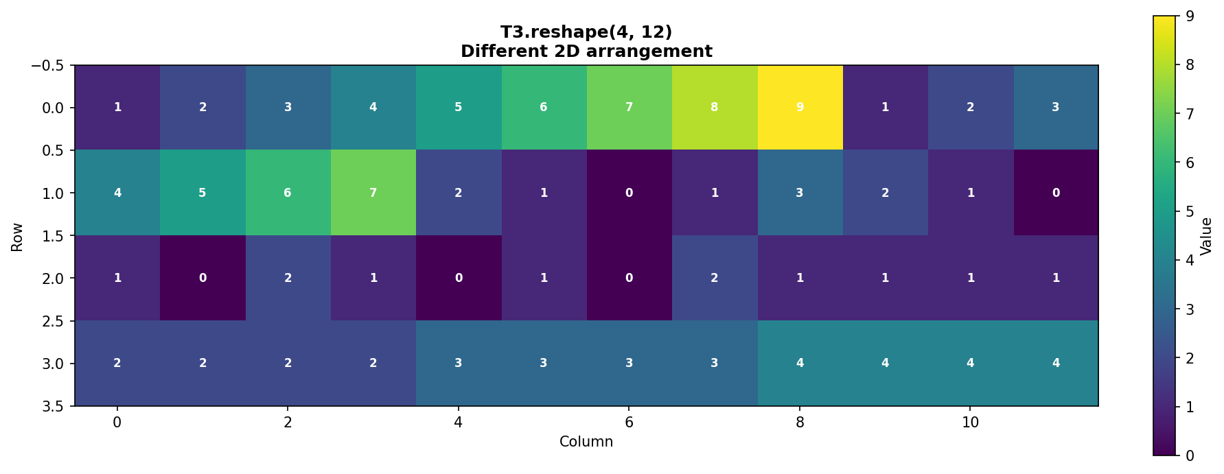
Figure 1.4.5.5: T3.reshape(4, 12) creates a different 2D arrangement. This demonstrates that the same data can be viewed in multiple valid configurations.
The Power of -1: Auto-Calculation
NumPy can automatically calculate one dimension when you specify -1:
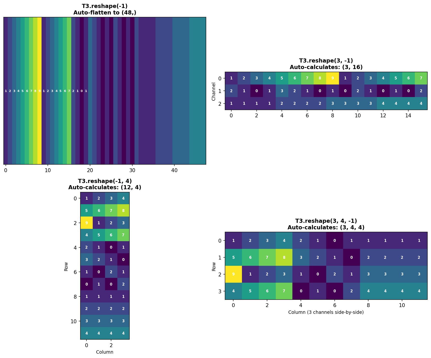
Figure 1.4.5.6: Four examples of using -1 for automatic dimension calculation. NumPy computes the missing dimension by dividing total elements by the product of specified dimensions.
Benefits of -1: - Less error-prone (no manual calculation) - More readable code - Adapts automatically if data size changes
Limitation: Only one dimension can be -1.
Transposing: Reordering Axes
The transpose() function reorders axes. This is crucial when converting between different data formats.
Common use case: Converting between CHW (Channels, Height, Width) and HWC (Height, Width, Channels) formats.
Understanding the transpose tuple (1, 2, 0): - Position 0 gets old axis 1 (rows become the first dimension) - Position 1 gets old axis 2 (columns become the second dimension) - Position 2 gets old axis 0 (channels become the third dimension)
![]()
Figure 1.4.5.7: Transposing from CHW (3,4,4) to HWC (4,4,3). Each spatial position now has all three channel values together. Each subplot shows one row of the HWC format.
When to transpose: - PyTorch → TensorFlow: CHW → HWC - NumPy → Matplotlib: Some functions expect HWC - Matrix operations: Transpose for linear algebra
Shortcut for 2D arrays:
For 3D+ arrays, always use np.transpose() with explicit axis ordering.
Reshape vs. Transpose: Key Differences
| Feature | reshape() |
transpose() |
|---|---|---|
| What it does | Changes shape, preserves element order | Reorders axes, changes element order |
| Memory | May return view or copy | Always returns view |
| Element order | Unchanged (row-major) | Changed (axes swapped) |
| Use case | Flatten, merge dimensions | Convert data formats (CHW↔︎HWC) |
| Example | (3,4,4)→(12,4) |
(3,4,4)→(4,4,3) |
Critical difference:
Practical Examples
Example 1: Preparing for fully connected layer (flattening)
Example 2: Batch processing
Example 3: Library compatibility
Example 4: Smart reshaping with -1
Common Pitfalls
Pitfall 1: Size mismatch
Pitfall 2: Multiple -1 dimensions
Pitfall 3: Confusing reshape and transpose
Quiz: Reshaping and Transposing
What does the -1 parameter do in reshape()?
Code Challenge Quiz: 3D Flatten
T3 is already defined with shape (3, 4, 4). Flatten it into a 1D array and print its shape so the output is exactly:
(48,)When you’re done, click Run Code to check your answer.
Key Takeaways
reshape()changes dimensions while preserving memory ordertranspose()reorders axes, essential for format conversion-1parameter auto-calculates one dimension (very useful!)flatten()creates a 1D copy;ravel()creates a 1D view- Total elements must be conserved in reshaping
- Row-major order (C-style) determines element sequence
- Transpose is not reshape - they serve different purposes
Understanding these operations is crucial for data preprocessing, interfacing between libraries, and manipulating arrays efficiently in scientific computing and machine learning workflows.
1.4.7 Interactive: 3D Array Slice Viewer
A 3D array is a stack of 2D matrices. Use the depth slider to step through individual slices — think of it as flipping through pages of a book. Each page is an independent 2D matrix with shape (height, width).
1.5 Four-Dimensional Arrays: Batch Processing
Images in deep learning and medical imaging are typically processed in batches—multiple images analyzed simultaneously for computational efficiency. To represent a batch of color images efficiently, we use 4D arrays with dimensions:
shape = (batch_size, channels, height, width)
This organizational structure is fundamental to how neural networks, image processing pipelines, and scientific computing frameworks (NumPy, PyTorch, TensorFlow) handle image data. Understanding 4D arrays is essential for implementing automated grading systems, batch normalization in deep learning, and efficient medical image analysis workflows.
1.5.1 Building a 4D Array from Scratch
Let’s construct a simple 4D array containing two color images (batch size = 2, each with 3 channels: red, green, blue) and a spatial dimension of 4×4 pixels.
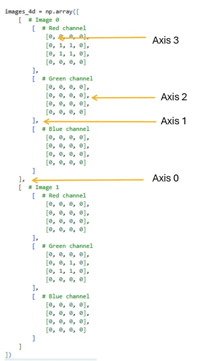
Figure 2.2.1: The four axes of a 4D array, showing how indexing with commas maps to each dimension. Axis 0 separates images in the batch, Axis 1 selects the color channel, Axis 2 selects the row, and Axis 3 selects the column. Mastering this indexing scheme is essential for efficient array manipulation.
The resulting shape (2, 3, 4, 4) represents: - Dimension 0 (batch): 2 images - Dimension 1 (channels): 3 color channels (RGB) - Dimension 2 (height): 4 pixels tall - Dimension 3 (width): 4 pixels wide
Each image is independent; Image 0 has a red square, while Image 1 has a green corner pattern. The remaining channel is all zeros.
Once you have separate 3D image arrays, you can also build this batch with np.stack([img0, img1], axis=0) — the same np.stack from the previous section, now stacking 3D images into a 4D batch.
Quiz: 4D Array Structure
What does each dimension represent in a 4D array with shape (batch, channels, height, width)?
1.5.2 Interactive: 4D Array Structure Explorer
A 4D array holds a batch of multi-channel images. Use the controls to set the array dimensions, then select a specific image and channel to inspect its 2D slice. The strip at the bottom shows all channels side-by-side for the selected image.
1.5.3 Complete Flattening: From 4D to 1D
The simplest reshape operation collapses the entire 4D structure into a single 1D array. This is useful for mathematical operations or converting to other data formats:
When we flatten, NumPy uses row-major order (C order by default), meaning it reads dimensions from right to left: the spatial dimensions (height and width) change fastest, followed by channels, then batch.
Quiz: Flattening 4D Arrays
If you flatten a 4D array with shape (2, 3, 4, 4), what is the resulting 1D shape?
1.5.4 Reshaping the Spatial Dimensions Only
Often we want to keep the batch and channel structure but flatten only the spatial grid:
This shape (2, 3, 16) is typical for feeding into neural network layers that require flattened spatial input. Computing per-channel means is a common operation in batch normalization.
1.5.5 Flattening Per-Image: Creating Feature Vectors
When preparing data for machine learning, we often want to flatten each image into a single feature vector while maintaining the batch dimension:
This (2, 48) shape is the standard input format for classifiers: each row is one sample, each column is one feature.
1.5.6 Batch Flattening: Merging Batch and Channel Dimensions
Sometimes we want to treat all channels from all images as separate “layers” in a unified 3D structure:
This (6, 4, 4) representation treats the 6 channel-images as a stack, useful for applying 2D operations uniformly across all channels.
1.5.7 Practical Exercise: Computing Channel Statistics
Let’s practice by computing meaningful statistics that demonstrate the array structure:
These indexing patterns are fundamental: images_4d[batch, channel, row, col] for specific pixels and images_4d[batch, channel] for entire channels.
1.5.8 Statistical Operations on 4D Arrays
Beyond simple indexing and reshaping, 4D arrays enable powerful statistical operations. The axis parameter in NumPy functions determines which dimension to aggregate over, fundamentally changing the shape and meaning of the result.
Computing the Mean Image
A common operation in image processing is computing a template or prototype image by averaging across the batch dimension. This collapses all images into a single representative image:
When we specify axis=0, NumPy averages across the batch dimension, reducing the shape from (2, 3, 4, 4) to (3, 4, 4). The resulting mean image has three channels (one per color) and 4×4 spatial dimensions.
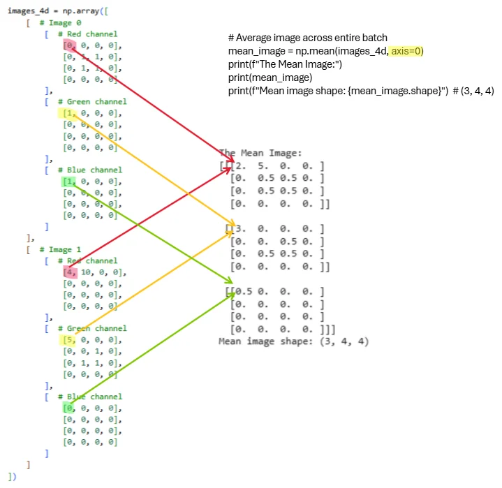
Figure 2.2.2: Visual representation of computing the mean image by averaging across the batch dimension. Each colored line traces how values from corresponding spatial locations and channels across both images combine into the mean. The operation np.mean(images_4d, axis=0) reduces the batch dimension while preserving all 3 channels and spatial structure. The resulting mean image has shape (3, 4, 4) and serves as a prototype representing the typical appearance across the batch.
Let’s verify the computed values. For Image 0 (red channel) we have a 2×2 square of ones, and for Image 1 (red channel) we have all zeros. Averaging these gives us 0.5 in the corresponding spatial locations:
Understanding the axis Parameter
The axis parameter controls which dimension gets aggregated. Let’s explore different reductions:
Practical Application: Batch Normalization Preprocessing
Computing per-channel statistics is essential for batch normalization, a fundamental technique in deep learning:
1.5.9 Understanding Memory Layout and Performance
When working with 4D arrays, the order of operations affects memory access patterns and performance:
Quiz: 4D Batch Operations
To compute the mean pixel value across all images in a batch (collapsing the batch dimension), which axis should you sum along?
1.6 Chapter 1 Conclusion
This chapter introduced the fundamental concepts of NumPy arrays from one-dimensional vectors through three-dimensional image arrays. Understanding array shapes, indexing with multiple coordinates, and axis-based operations forms the foundation for all numerical computing in Python. These concepts apply broadly across scientific computing, data analysis, and machine learning.
Key principles to remember:
- Array shape describes dimensionality as a tuple of integers
- Indexing and slicing extract subsets efficiently; colon notation selects entire dimensions
- Axis-based operations reduce dimensionality along specified axes
- Vectorization eliminates explicit loops for better performance
- Different visualizations emphasize different data aspects—choose based on your analytical goal
- Broadcasting enables operations between differently-shaped arrays
- Understanding axis order (e.g., CHW vs HWC) is crucial for image processing
Looking ahead to Chapter 2: We’ll extend these concepts to four-dimensional arrays representing batches of images, explore image interpolation techniques for resizing and resampling, and examine color mapping strategies for effective data visualization. The 4D structure (batch, channels, height, width) is fundamental to modern deep learning frameworks.
1.7 Exercises
1.7.1 Exercise 1.1: Creating and Visualizing 1D Arrays
Given: Create a 1D array representing daily temperatures for a week
Task:
- Create array:
temps = [68, 72, 75, 73, 70, 69, 71]
- Calculate mean, median, min, max temperatures
- Create THREE different visualizations (line, bar, scatter)
- Add appropriate titles and labels to all plots
Complete all parts in the Pyodide cell below and click Submit when done.
1.7.2 Exercise 1.2: 2D Matrix Operations
Given: Two 3×3 matrices representing quiz scores and adjustments
Task:
- Add matrix B to A (grade adjustments)
- Calculate mean score per student (axis=1)
- Calculate mean score per quiz (axis=0)
- Find which student has the highest average
- Visualize both matrices using imshow with different colormaps
Complete all parts in the Pyodide cell below and click Submit when done.
1.7.3 Exercise 1.3: RGB Image Creation
Given: Create a 3D array representing a simple 8×8 RGB image
Task:
- Create an 8×8 image with shape (3, 8, 8):
- Red channel: checkerboard pattern (alternating 0s and 1s)
- Green channel: gradient from 0 (top) to 1 (bottom)
- Blue channel: all 0.5
- Display the RGB image using imshow (transpose to HWC format first)
- Extract and display each channel separately in a 1×3 subplot
- Convert to grayscale using BT.709 weights: R=0.2125, G=0.7154, B=0.0721
- Compare original RGB vs grayscale side-by-side in a 1×2 subplot
Complete all parts in the Pyodide cell below and click Submit when done.
1.7.4 Exercise 1.4: Axis Operations Challenge
Given: Create a 3×4×5 array with strategic placement of ones
Task:
- Create array where:
- Position [0, 0, 0] = 1
- Position [1, 2, 3] = 1
- Position [2, 1, 4] = 1
- All other positions = 0
- Compute sum along axis 0 (result shape: 4×5)
- Compute sum along axis 1 (result shape: 3×5)
- Compute sum along axis 2 (result shape: 3×4)
- Compute mean along all three axes: (0, 1, 2) (result: scalar)
- Verify your axis 0 sum by hand calculation for position [0,0]
- Explain in words what each axis represents
Complete all parts in the Pyodide cell below and click Submit when done. Write hand calculations and explanations as # comments.
1.7.5 Exercise 1.5: Real-World Data Visualization
Given: Monthly rainfall data (millimeters)
Task:
Create array:
rainfall_mm = [45, 52, 38, 25, 15, 8, 5, 10, 18, 35, 40, 50]Create a 2×2 subplot grid showing:
- Top-left: Line plot with markers
- Top-right: Bar plot
- Bottom-left: Histogram with 4 bins
- Bottom-right: Box plot
Add an overall title: ‘Monthly Rainfall Analysis’
Add descriptive subtitles to each subplot
Calculate and print: wettest month, driest month, average rainfall
Add gridlines to the line and bar plots for easier reading
Complete all parts in the Pyodide cell below and click Submit when done.
1.7.6 Exercise 1.6: Three-Dimensional Axis Operations
Given: Create a small 3D array for hand calculation practice
Task:
- Create the following 3D array:
- Sum along axis 0 (collapse channels)
- Use:
sum_axis0 = np.sum(A, axis=0) - Predict the output shape BEFORE running
- Hand-calculate the value at position [0, 0]
- Hand-calculate the value at position [1, 2]
- Verify with code
- Use:
- Sum along axis 1 (collapse rows)
- Use:
sum_axis1 = np.sum(A, axis=1) - Predict the output shape BEFORE running
- Hand-calculate all values for Channel 0
- Verify with code
- Use:
- Sum along axis 2 (collapse columns)
- Use:
sum_axis2 = np.sum(A, axis=2) - Predict the output shape BEFORE running
- Hand-calculate all values for Channel 1
- Verify with code
- Use:
- Sum along multiple axes
- Calculate
np.sum(A, axis=(1, 2))- what shape? What values? - Calculate
np.sum(A)- what is the total? - Verify both by hand
- Calculate
- Other operations
- Calculate
np.mean(A, axis=0)- predict shape and values at [0, 0] - Calculate
np.max(A, axis=1)- predict shape and values - Calculate
np.min(A, axis=2)- predict shape and values
- Calculate
Complete all parts in the Pyodide cell below and click Submit when done. Write hand calculations, shape predictions, and explanations as # comments.
1.7.7 Exercise 1.7: Reshaping and Transposing Mastery
Given: Work with a small array to understand reshaping operations
Task:
- Create the following 3D array:
- Flatten the array
- Use
flat = B.flatten() - Write out the first 12 elements BY HAND in the order they appear
- Verify with code
- Explain why the order is: [1, 2, 3, 4, 5, 6, 10, 20, 30, 40, 50, 60]
- Use
- Reshape to (4, 3) - Merge channels and rows
- Use
r1 = B.reshape(4, 3) - Draw a 4×3 grid and fill in the values BY HAND
- Which rows belong to Channel 0? Which to Channel 1?
- Verify with code
- Use
- Reshape to (2, 6) - Merge rows and columns
- Use
r2 = B.reshape(2, 6) - Draw a 2×6 grid and fill in the values BY HAND
- Describe what this represents (hint: each channel’s spatial data flattened)
- Verify with code
- Use
- Reshape to (3, 4) - Different arrangement
- Use
r3 = B.reshape(3, 4) - Predict what the output will look like
- Verify with code
- Use
- Use the
-1parameter- Calculate
B.reshape(2, -1)- what does NumPy auto-calculate? - Calculate
B.reshape(-1, 2)- what shape does this give? - Calculate
B.reshape(-1)- equivalent to what operation? - Why can’t you do
B.reshape(-1, -1)?
- Calculate
- Transpose the array (CHW → HWC)
- Use
B_hwc = np.transpose(B, (1, 2, 0)) - What is the new shape?
- Draw what
B_hwc[0, :, :]looks like (first row, all columns, all channels) - At position [0, 0], what are the values for all channels?
- Verify with code
- Use
- Reshape vs Transpose comparison
- Create
reshaped = B.reshape(2, 3, 2) - Create
transposed = np.transpose(B, (0, 2, 1)) - Are they the same? Why or why not?
- Print
reshaped[0, 0, :]andtransposed[0, 0, :]- explain the difference
- Create
- Invalid reshapes (predict the error!)
- Try
B.reshape(3, 3)- what error? Why? - Try
B.reshape(2, 2, 2)- what error? Why? - Try
B.reshape(-1, -1, 3)- what error? Why?
- Try
Complete all parts in the Pyodide cell below and click Submit when done. Write hand calculations, grid predictions, and explanations as # comments.
1.7.8 Exercise 1.8: 4D Array Reshaping and Channel Statistics
Objective: Practice reshaping 4D arrays and computing per-channel statistics.
Problem Setup
You are given a batch of 3 grayscale medical images (3×5×5 pixels each), stored as a 4D array with a single channel:
Tasks
Part A: Reshape for Machine Learning
Flatten the batch into a format suitable for a classifier. Each image should become a single feature vector (1D array), with the batch dimension preserved.
- What is the new shape?
- Print the feature vector for Image 1 (first 15 elements).
- Compute the mean intensity for each image across all pixels.
Complete Part A in the cell below and click Submit when done.
Part B: Compute Statistics Across the Batch
Create a template image by averaging across all 3 images.
- What is the shape of the template image?
- Print the template image.
- What is the mean intensity of the template image?
Complete Part B in the cell below and click Submit when done.
Part C: Channel Normalization
Compute the per-channel mean and standard deviation across the entire batch (treating the single channel separately).
- Print the per-channel mean.
- Print the per-channel standard deviation.
- Normalize the batch using: \(\text{normalized} = (\text{images} - \text{mean}) / (\text{std} + 1\times10^{-8})\)
- Verify that the normalized batch has mean ≈ 0 and std ≈ 1.
Complete Part C in the cell below and click Submit when done.