2.1 Introduction to Image Interpolation and Matplotlib Visualization
Image interpolation answers a fundamental question: How do we resize an image to different dimensions?
When enlarging an image (e.g., 10×10 → 20×20), new pixel values must be estimated. When reducing (e.g., 20×20 → 10×10), information from multiple pixels is summarized into single output pixels. Both tasks require interpolation—estimating values at positions where we don’t have direct measurements.
Several interpolation methods exist, each with different tradeoffs in quality, speed, and smoothness. This section explores the most commonly used approaches with visual demonstrations and hands-on code examples.
2.1.1 Creating and Inspecting Test Images
Let’s start with a simple artificial image that has clear structure, making it easy to see how different interpolation methods affect the output.
Let’s understand the structure of our test image:
The test image has a clear structure: concentric squares with decreasing values from the edge (white, 1.0) toward the center (black, 0.0). This structure makes it easy to visually evaluate how well each interpolation method preserves edges and transitions.
Figure 2.1.0: The 10×10 test image displayed as a heatmap with explicit pixel values shown in each cell. Notice that the image is very small—only 10 pixels wide and 10 pixels tall. When we want to enlarge this image, we need to estimate what values should exist at all the positions in between these discrete measurements.
Want to see how pixel values map to brightness? Click any cell in the grid below, type a new value between 0.0 and 1.0, and press Enter to see the color update live:
In matplotlib, every visualization lives inside a figure—think of it as a blank canvas. The figure holds one or more axes objects, where each axis is an individual panel you can draw on. When working with images in a multi-panel layout, the standard pattern is to create both at once with plt.subplots():
fig, axes = plt.subplots(1, 2, figsize=(10, 4))
This creates a figure with a 1×2 grid of panels. figsize=(10, 4) sets the canvas width and height in inches. The function returns two things: fig (the canvas itself) and axes (an array of panel objects). With a single row, you access each panel as axes[0], axes[1], and so on. With a 2D grid, you use two indices: axes[0, 1] means row 0, column 1.
Each axis exposes a small set of methods you’ll call constantly when displaying images:
axes[0].imshow(image, cmap='gray') # display the array as an imageaxes[0].set_title("My Image") # label the panelaxes[0].axis('off') # hide tick marks and borders
Here’s a complete working example using our test image:
plt.tight_layout() adjusts spacing between panels so that titles don’t overlap. Notice we call .imshow() and .set_title() on the axis object, not on plt directly. This is the object-oriented style and is standard practice whenever you have more than one subplot. The plt.imshow() shorthand still works for a single image, but once you start comparing things side by side—which comes up constantly in image processing—the axis-based approach scales naturally to any grid size.
Shorthand notation
Matplotlib also has a compact alternative for quick, exploratory work: plt.subplot(ABC). The three digits encode (rows, columns, position), so plt.subplot(121) means “1 row, 2 columns, panel 1.” Here’s the same example written as shorthand:
Both styles produce identical output. The shorthand saves a few keystrokes when sketching something quickly; plt.subplots() is easier to manage when your layout has more than two or three panels.
Quiz: Matplotlib Display Functions
Which call correctly creates a figure with 1 row and 2 columns of subplots and returns the figure and an array of axes?
2.1.3 Data Types and Display Ranges
imshow() behaves differently depending on the data type of your array. Matplotlib understands two common conventions:
float arrays (float32, float64): values are expected to be in [0, 1]. Anything above 1.0 clips to white; anything below 0.0 clips to black.
uint8 arrays: values are expected to be in [0, 255].
This mismatch is one of the most common silent bugs in image code. If you load an image as uint8 (values 0–255) and then do some computation that returns a float array—but forget to divide by 255—you end up with floats like 150.0. Matplotlib clips everything above 1.0 to white with no error message, and your image appears as a blank white rectangle.
The safe rule: before calling imshow(), know your dtype and value range. If your array is float, ensure values are in [0, 1]. Use np.clip(arr, 0, 1) when in doubt—it’s inexpensive and prevents these silent display errors.
Quiz: Data Types and Display
A float32 array contains values ranging from 0 to 200. What will imshow() display?
2.1.4 Array Shape and Color Channels
imshow() infers how to display your array from its shape:
Shape
Interpretation
(H, W)
Grayscale — displayed with a colormap
(H, W, 3)
RGB color — red, green, blue channels
(H, W, 4)
RGBA — RGB plus a per-pixel transparency channel
A shape of (H, W, 1) will raise an error. Matplotlib expects either no trailing dimension (grayscale) or exactly 3 or 4 channels. This trips people up often when working with deep learning frameworks, which frequently add a channel dimension to everything. If your array has this shape, squeeze it first with image.squeeze() or image[:, :, 0] before passing to imshow().
For grayscale images, always pass cmap='gray' explicitly. Without it, matplotlib applies its default colormap (viridis), which maps low values to dark purple and high values to yellow—visually misleading for any grayscale medical image.
Quiz: Array Shapes
What happens when you pass an array with shape (H, W, 1) directly to imshow()?
2.1.5 Overlaying Segmentation Masks
One of the most important visualization patterns in medical image analysis is overlaying a segmentation mask on top of the original image. The technique is to display the image first, then call imshow() a second time on the same axis with the alpha parameter, which controls transparency: 0.0 is fully transparent (invisible), 1.0 is fully opaque.
You can call imshow() multiple times on the same axis—each call layers over the previous one. The base image is fully opaque; the mask sits on top at 50% transparency so the underlying cell structure shows through.
One issue with the overlay above: background pixels (where mask == 0) also receive a color from the Reds colormap, which partially washes out the original image. To show only the foreground while leaving background pixels completely transparent, use a masked array:
This pattern—grayscale base image with a colored semi-transparent mask on top—is standard in every segmentation workflow. You’ll use it throughout this course whenever you want to check that a model’s predicted cell boundaries actually align with the image.
Quiz: Segmentation Mask Overlay
You want to display a segmentation mask over a grayscale image so that only foreground pixels (mask == 1) are colored — background pixels should be completely transparent. Which approach achieves this?
2.1.6 Saving Figures
Once you’ve built a visualization you want to keep, plt.savefig() writes it to disk. The file format is inferred from the extension:
fig, ax = plt.subplots(figsize=(6, 6))ax.imshow(image, cmap='gray')ax.set_title("Saved Figure")ax.axis('off')plt.tight_layout()plt.savefig('output.png', dpi=150, bbox_inches='tight')plt.savefig('output.pdf') # vector format — preferred for papersplt.show()
Two parameters matter most:
dpi (dots per inch): controls output resolution. 72 dpi is screen quality; 150–300 dpi suits reports and print.
bbox_inches='tight': trims extra whitespace around the figure. Almost always what you want.
One ordering gotcha: call plt.savefig()beforeplt.show(). Once the figure is displayed and closed, matplotlib discards it, and a subsequent savefig() produces a blank image.
2.2 Interpolation Methods
2.2.1 The Core Problem: Filling the Gaps
When we resize an image, we’re asking: “What pixel values should exist at positions that weren’t in the original data?” The original 10×10 image contains discrete measurements at specific grid locations. When we enlarge it—say, from 10×10 to 40×40—we need to invent values for the 1,500 new pixels that sit between the original 100. When we shrink it, we need to summarize multiple pixels into one.
The same question arises in two different contexts you’ll encounter constantly:
Displaying an image: when matplotlib renders a small array on a large screen, it needs to fill in screen pixels between data pixels.
Resizing an array: when you preprocess images for a neural network with cv2.resize() or skimage.transform.resize(), you’re computing an entirely new array at a different resolution.
Both contexts use the same underlying algorithms. The difference between them matters and we’ll come back to it after working through the methods themselves.
Pixel Values Visualization
Figure 2.1.0a: The 10×10 test image with explicit pixel values. Each cell is one pixel. Enlarging this image means inventing values for all the gaps between these discrete measurements.
2.2.2 What is a Kernel?
Every interpolation method works by sliding a small window—the kernel—to each position where we need an estimate. The kernel looks at some number of surrounding original pixels, assigns each a weight, and returns a weighted average as the estimated value. The methods differ only in how many neighbors they consult and how the weights are distributed.
To see this concretely, let’s pull out a 3×3 patch from the boundary region of our test image—where values actually change:
Suppose we’re doubling this image and need to estimate a value for a new pixel that sits at the midpoint between the four pixels in the top-left 2×2 block: (1,1)=0.8, (1,2)=0.8, (2,1)=0.8, (2,2)=0.6. Here is how each method answers that question.
2.2.3 Nearest Neighbor Interpolation
The simplest approach: find the single closest original pixel and copy its value. No blending, no averaging—just a lookup.
For a new pixel at the midpoint between (1,1)=0.8 and (2,2)=0.6, nearest neighbor snaps to the closest grid point and returns that one value. The other three neighbors are ignored entirely.
This preserves exact original values and is the fastest method, but creates hard jumps at boundaries. When you enlarge an image this way, each original pixel expands into a solid block of identical values, producing the characteristic staircase or pixelated appearance.
Nearest Neighbor Interpolation Example
Figure 2.1.1: Nearest neighbor interpolation on the 10×10 test image rendered at a larger display size. Each original pixel becomes a solid block, creating visible staircase edges at value boundaries.
The right time to use nearest neighbor is when your data represents discrete labels rather than continuous measurements—for example, a segmentation mask where value 1 means “cell” and value 2 means “nucleus.” Blending those labels would produce meaningless fractional values like 1.4.
Quiz: Nearest Neighbor Interpolation
A segmentation mask assigns labels 0 (background), 1 (cell), or 2 (nucleus) to each pixel. If you resize this mask using bilinear interpolation, what is the main problem?
2.2.4 Bilinear Interpolation
Instead of a single winner, bilinear blends the four nearest neighbors using distance-based weights: closer neighbors contribute more, farther neighbors contribute less.
For a new pixel sitting exactly halfway between all four corners, every distance is equal, so all weights are 0.25:
The answer is 0.75—a smooth blend rather than a hard snap. If the output position were closer to (2,2)=0.6, its weight would be larger and the result would shift toward 0.6. The general formula for a point at fractional offset \((dx, dy)\) from the top-left corner is:
Bilinear interpolation is the standard default for most image processing. It’s fast and produces smooth, artifact-free results without visible blocks.
2.2.5 Bicubic Interpolation
Bilinear looks at 4 neighbors and fits a linear surface through them. Bicubic extends this idea to 16 neighbors (a 4×4 grid) and fits a smooth cubic surface. The larger neighborhood means the output not only matches surrounding pixel values but also respects their rate of change—transitions through edges stay smooth in a way that linear blending can’t achieve.
The cubic weighting function gives small negative weights to the outermost ring of neighbors. This produces slight sharpening at edges and is why bicubic often preserves structural boundaries better than bilinear—particularly useful for medical images where cell edges matter.
The tradeoff is computation: 16 lookups and a more complex weight formula versus 4 for bilinear. For display and publication figures, bicubic is the better choice. For preprocessing pipelines that resize millions of images in a training loop, bilinear is usually the pragmatic default.
where \(w(t)\) is a cubic polynomial chosen to be smooth and continuous at every point.
2.2.6 Gaussian and Lanczos
These two methods are available as imshow() options. Gaussian interpolation weights neighbors by a bell curve, producing very soft output—effectively upsampling plus blur. Lanczos uses a windowed sinc function that minimizes ringing artifacts and tends to produce the sharpest result of any standard method. Both are slower than bicubic and rarely worth the overhead for routine image processing work. Knowing they exist and what they do visually is enough for most purposes.
2.2.7 Summary
Method
Neighbors
Best for
Nearest
1
Discrete labels, segmentation masks
Bilinear
4 (2×2)
General images, ML preprocessing
Bicubic
16 (4×4)
Medical/scientific images, publication figures
Gaussian
~16
Soft visualization (display only)
Lanczos
~16–64
Highest-quality display (display only)
The fundamental tradeoff: more neighbors produce smoother, higher-quality results but require more computation.
2.2.8imshow() vs. Actually Resizing an Array
This distinction is worth stating clearly because it trips people up constantly.
When you write plt.imshow(image, interpolation='bilinear'), you are giving matplotlib a rendering hint—a suggestion for how it should stretch the array’s pixels to fill your screen. The numpy array itself is not touched. Its shape is identical before and after:
To produce a new array at different dimensions, you use cv2.resize() or skimage.transform.resize(). The same three interpolation algorithms apply—now they’re computing real pixel values stored in memory rather than just rendering to a screen.
Note
cv2 (OpenCV) is not available in the browser environment. Run this code locally in Python to see the output.
import cv2print(f"Original: {image.shape}\n")# cv2.resize takes (width, height) — note: OPPOSITE of numpy's (height, width)up_nearest = cv2.resize(image, (40, 40), interpolation=cv2.INTER_NEAREST)up_bilinear = cv2.resize(image, (40, 40), interpolation=cv2.INTER_LINEAR)up_bicubic = np.clip(cv2.resize(image, (40, 40), interpolation=cv2.INTER_CUBIC), 0, 1)print(f"Upsampled (10×10 → 40×40): {up_nearest.shape}")# INTER_AREA is recommended for downsampling — averages over source regions# to avoid aliasing artifacts that bilinear/bicubic can introduce when shrinkingdown = cv2.resize(image, (5, 5), interpolation=cv2.INTER_AREA)print(f"Downsampled (10×10 → 5×5): {down.shape}")
Warning
cv2 axis order:cv2.resize(image, (width, height)) takes width first. NumPy arrays store data as (height, width), so image.shape returns (height, width). Passing image.shape directly to cv2.resize() swaps rows and columns—a common bug with non-square images.
# Compare actual array upsampling: display with interpolation='nearest'# so matplotlib doesn't add a second layer of smoothing on topfig, axes = plt.subplots(1, 4, figsize=(14, 4))axes[0].imshow(image, cmap='gray', interpolation='nearest')axes[0].set_title(f"Original\n{image.shape}")axes[0].axis('off')for ax, arr, label inzip( axes[1:], [up_nearest, up_bilinear, up_bicubic], ['INTER_NEAREST', 'INTER_LINEAR\n(bilinear)', 'INTER_CUBIC\n(bicubic)']): ax.imshow(arr, cmap='gray', interpolation='nearest') ax.set_title(f"cv2.resize → {arr.shape}\n{label}") ax.axis('off')plt.suptitle("Actual array upsampling: 10×10 → 40×40", fontsize=12, y=1.02)plt.tight_layout()plt.show()
2.2.9 Comparing Methods Visually
Now that you understand how each algorithm works, here is the same 10×10 array displayed at screen size by the three main imshow() interpolation options. All three panels represent identical data—only the screen rendering differs.
2.3 Colormaps for Data Visualization
A colormap is a mapping from numerical values to colors. It’s essential for visualizing grayscale, single-channel, or multi-valued data as color images. Matplotlib provides comprehensive built-in colormaps, each suited to different types of data and visualization goals.
2.3.1 Colormap Categories
Perceptually Uniform Sequential: These colormaps are designed to have an evenly changing luminance (brightness) throughout their range. They are good for representing data where continuity and order are important. Use these for scientific data where accurate perception of magnitude is critical.
Sequential: These colormaps are also for ordered data, often representing quantities from low to high. They may not be perceptually uniform but are intuitive.
Warm to cold: Greys, Purples, Blues, Greens, Oranges, Reds
Diverging: These colormaps are used when data has a meaningful mid-point (e.g., zero) and diverges in two directions (e.g., positive/negative, above/below average). Essential for showing deviations from a reference value.
Cyclic: These colormaps are for data that wraps around, like phase angles or directions. The beginning and end of the colormap have the same color.
twilight, twilight_shifted, hsv
Qualitative: Used for discrete categories, where no ordering or relationship between categories is implied. Good for segmentation masks and categorical labels.
For scientific data and publication, prefer perceptually uniform colormaps:
For data with a meaningful center (like differences from zero), use diverging colormaps:
For discrete categories (segmentation masks), use qualitative colormaps:
Quiz: Choosing a Colormap
You are visualizing a difference image where pixel values range from −0.3 to +0.3, with zero meaning no change. Which colormap and settings are most appropriate?
2.3.3 Colormap Examples Gallery
2.3.4 Important Considerations
Always include a colorbar when publishing visualizations—it allows readers to interpret the actual values, not just relative differences.
Fix vmin and vmax when comparing multiple images so all images use the same color scale:
Avoid jet colormap for scientific data—it’s not perceptually uniform and can mislead viewers. Use viridis, plasma, or inferno instead.
Quiz: Colorbars and Comparison
You are displaying two images side by side and want a single shared colorbar. Which call places one colorbar that steals space equally from both axes?
Interactive: Colormap & Display Range Explorer
vmax=1.00
vmin=0.00
Try: raise vmin to 0.6 to clip dark regions to the colormap minimum. Lower vmax to 0.4 to saturate bright regions to the colormap maximum.
Python equivalent — updates as you adjust the controls:
Real-world images are never perfect. Every sensor, camera, or imaging device introduces noise—random variations in pixel values that obscure the true underlying signal. Noise comes from multiple sources:
Sensor noise: Thermal variations in camera sensors (especially important in low-light conditions)
Quantization noise: Rounding errors when converting continuous signals to discrete pixel values
Transmission noise: Corruption during data transmission or storage
In medical imaging, computer vision, and machine learning, understanding and handling noise is critical. Algorithms trained on noisy data may learn the noise patterns instead of the true signal, degrading their ability to generalize to new, clean data. Conversely, aggressive noise removal can destroy important details.
2.4.2 Types of Noise and Generation Methods
Different types of noise require different analysis and denoising approaches. Let’s explore the most common noise models:
Gaussian Noise
Gaussian (or white) noise is the most commonly used noise model. It assumes each pixel’s noise follows a normal distribution with mean 0 and standard deviation σ.
How it works:np.random.normal(mean, std, shape) generates values from a normal distribution. With mean=0, each pixel gets a random deviation centered around zero.
Use cases: - Simulating camera sensor noise - Thermal noise in electronics - Most common assumption in image processing
Now let’s add noise to the test image and visualize the effect:
Comparing noisy versions at different noise levels:
Interactive: Noise Explorer
Original (clean)
Noisy
Python equivalent — updates as you adjust the controls:
1. Poisson Noise (photon noise) - Inherent in photon counting processes - Variance equals the mean intensity - More realistic for low-light images - Generated with np.random.poisson()
2. Salt-and-Pepper Noise (impulse noise) - Random pixels set to min (0) or max (255) values - Common in data transmission errors - Created by randomly replacing pixels with extreme values
3. Uniform Noise - All random values equally likely within a range - Less realistic than Gaussian but simpler - Generated with np.random.uniform()
4. Speckle Noise (multiplicative noise) - Multiplies each pixel value by a random factor - Common in radar and ultrasound imaging - Characterized as signal-dependent
2.4.3 Summary of Noise Models
Noise Type
Generation
Characteristics
Common Applications
Gaussian
np.random.normal()
Independent, signal-independent
General camera noise, simulations
Poisson
np.random.poisson()
Signal-dependent variance
Low-light photography, counting detectors
Salt-and-Pepper
Random extremes
Discrete impulses
Transmission errors, corrupted data
Uniform
np.random.uniform()
All values equally likely
Quantization effects, theoretical models
Speckle
Multiplicative
Signal-dependent, correlated
Radar, ultrasound, SAR imagery
Quiz: Noise Types
Speckle noise is described as “multiplicative.” What does this mean for a bright region (pixel value ≈ 1.0) compared to a dark region (pixel value ≈ 0.1)?
2.4.4 Denoising Methods
Now that we understand how noise is generated, let’s explore methods to remove it. Different denoising techniques have different strengths, and the choice depends on the noise type and desired preservation of image details.
Gaussian Filtering (Blur-based Denoising)
The simplest denoising approach is Gaussian filtering, which smooths the image by averaging neighboring pixels with a Gaussian-weighted kernel. This works well for Gaussian noise but will blur fine details.
Advantages: Fast, simple, works reasonably well for Gaussian noise Disadvantages: Blurs edges and fine details significantly Best for: Mild Gaussian noise where edge preservation is not critical
Median Filtering
Median filtering replaces each pixel with the median value of its neighbors. This is particularly effective for salt-and-pepper noise and impulse noise, while preserving edges better than Gaussian filtering.
Advantages: Preserves edges better, excellent for impulse noise Disadvantages: Can remove fine structures, computational cost increases with filter size Best for: Salt-and-pepper noise, impulse noise
Quiz: Median Filtering
Which noise type is median filtering most effective against, and why?
Non-Local Means Denoising
Non-local means (NLM) is a state-of-the-art denoising method that searches for similar patches across the image and averages them. This preserves edges and fine details much better than simple filtering.
Advantages: Excellent edge preservation, highest quality results, works for most noise types Disadvantages: Slower (though fast_mode=True helps), requires parameter tuning Best for: High-quality denoising when computational cost is acceptable
2.4.5 Comparison of Denoising Methods
Method
Speed
Quality
Edge Preservation
Best For
Gaussian Filter
⚡⚡⚡
⭐⭐
⭐
Mild noise, speed-critical
Median Filter
⚡⚡
⭐⭐⭐
⭐⭐⭐
Impulse noise, salt-and-pepper
Non-Local Means
⚡
⭐⭐⭐⭐⭐
⭐⭐⭐⭐
High-quality results, any noise type
2.5 Unsharp Masking: Enhancing Image Contrast and Sharpness
While denoising removes unwanted noise, unsharp masking is a complementary technique that enhances image sharpness by amplifying edges and fine details. Despite its counterintuitive name, unsharp masking doesn’t actually “unsharpen”—instead, it creates a blurred copy of the image and subtracts it from the original, emphasizing high-frequency details (edges).
2.5.1 What Unsharp Masking Does
Unsharp masking works by the following principle:
Create a blurred version of the original image (typically using Gaussian blur)
Subtract the blurred version from the original
Add back a scaled amount of this difference to the original
This creates an edge enhancement effect without introducing noise artifacts like simple high-pass filters. It’s particularly useful in medical imaging where edge contrast is diagnostically important.
2.5.2 Libraries and Basic Parameters
Unsharp masking is available in multiple libraries:
Key parameters to adjust:
radius (σ): Standard deviation of the Gaussian blur. Larger values sharpen broader features; smaller values sharpen fine details. Typical range: 0.5-3.0
amount: Strength of the sharpening effect. Controls how much of the edge information is added back. Typical range: 0.5-2.0
preserve_range: If True, keeps output in the same range as input (important for uint8 images)
2.5.3 Implementation on Toy Images
Let’s start with simple test images to understand the effect:
Now let’s apply unsharp masking with different parameters:
Quiz: Unsharp Masking
With amount=1.0, what does unsharp masking compute, and what is the visual effect?
2.5.4 Denoising Real Medical Images: Cedar Sinai Urothelial Cells
Now let’s apply denoising and sharpening techniques to real microscopy images from the Cedar Sinai dataset:
Setting Up the Cedar Sinai Data
import pandas as pdimport numpy as npimport matplotlib.pyplot as plt
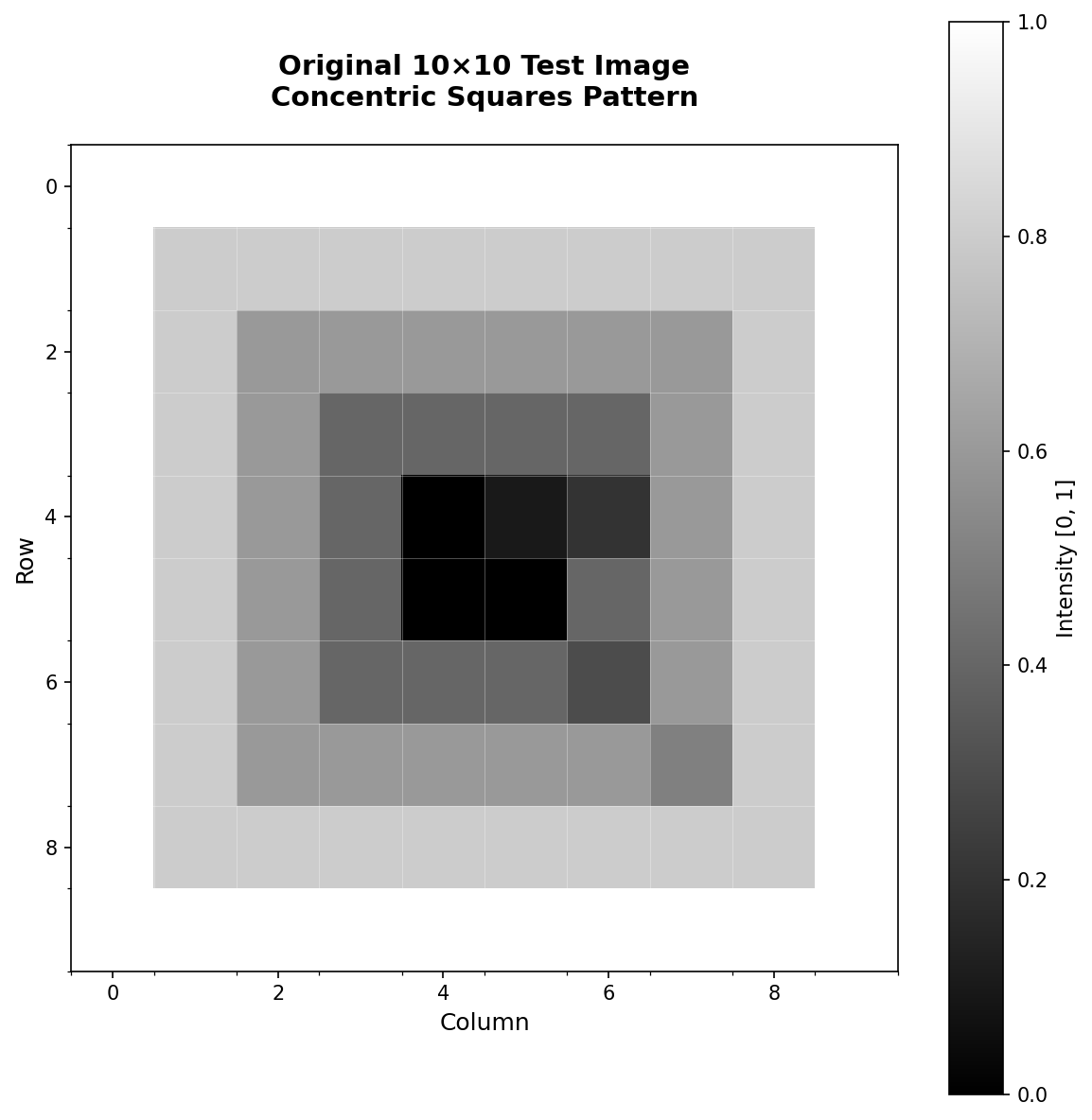
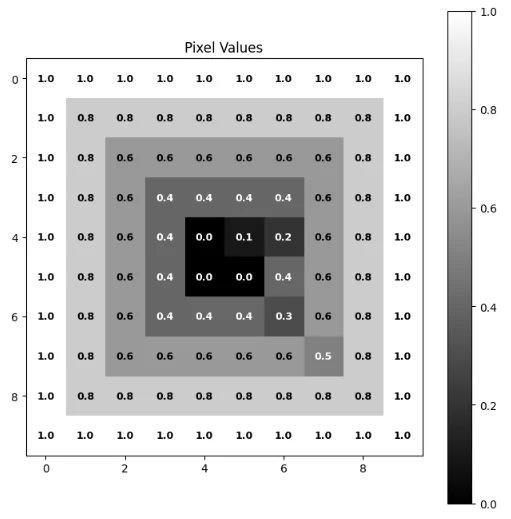
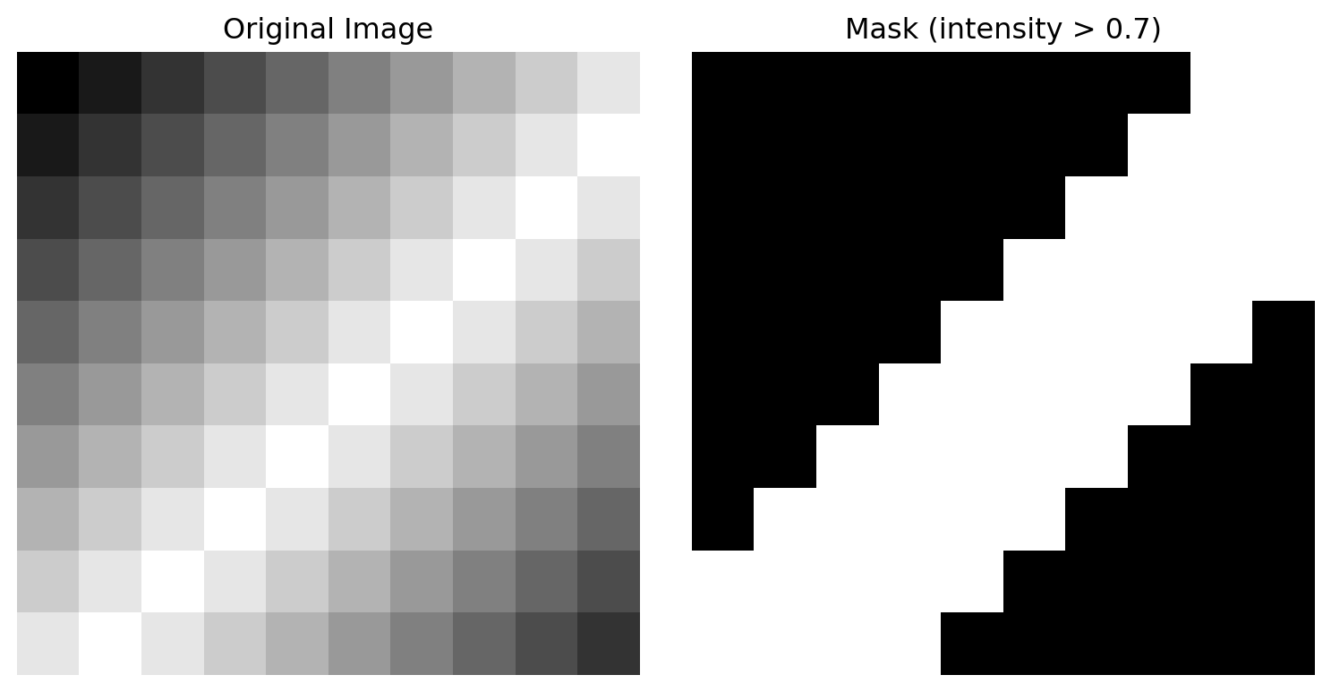
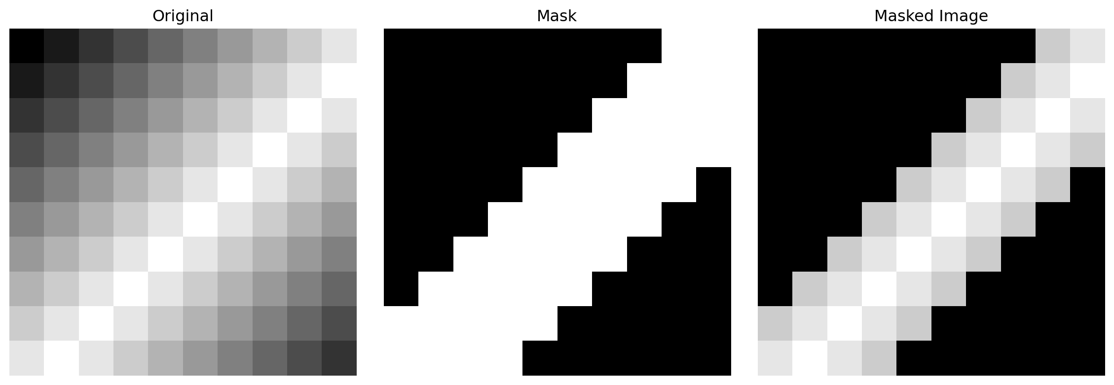
from scipy import ndimagefrom scipy.ndimage import gaussian_filter, median_filterfrom skimage import filters, feature, exposurefrom skimage.restoration import denoise_nl_meansfrom skimage.filters import unsharp_maskimport warningswarnings.filterwarnings('ignore')# ============================================================================# LOAD CEDARS SINAI UROTHELIAL CELL DATA# ============================================================================# Note: If running in Jupyter/Colab, uncomment and run:# !git clone https://github.com/emilsar/Cedars.git# %cd Cedars/Project3# !python 1_prepdata.py# Load the preprocessed data — tries Windows path first, falls back to local Cedars clonetry: urothelial_cells = pd.read_pickle("C:/Cedars/Project3/urothelial_cell_toy_data.pkl")exceptFileNotFoundError: urothelial_cells = pd.read_pickle("Cedars/Project3/urothelial_cell_toy_data.pkl")# Convert to uint8 image format (0-255)# Original shape: (batch, channels, height, width)# Target shape: (batch, height, width, channels)images = np.transpose(urothelial_cells["X"].numpy() *255, (0, 2, 3, 1)).astype(np.uint8)labels = urothelial_cells["y"]print(f"Dataset shape: {images.shape}") # (N_images, height, width, channels)print(f"Data type: {images.dtype}")print(f"Value range: [{images.min()}, {images.max()}]")# Select image to processimg_number =2original_image = images[img_number].astype(np.float32) /255.0# Normalize to [0, 1]print(f"\nProcessing image {img_number}")print(f"Image shape: {original_image.shape}")print(f"Value range: [{original_image.min():.3f}, {original_image.max():.3f}]")
Dataset shape: (200, 256, 256, 3)
Data type: uint8
Value range: [0, 255]
Processing image 2
Image shape: (256, 256, 3)
Value range: [0.071, 1.000]
Applying Multiple Denoising Techniques
Once the data is loaded, apply multiple denoising techniques and display them side-by-side:
Median filter: Salt-and-pepper noise, preserves sharp boundaries
Non-Local Means: Best quality for research/publication, computational time acceptable
Unsharp Masking: Enhance contrast without removing detail, combine with denoising
Combined (Denoise + Sharpen): Medical imaging where both noise reduction and edge clarity are critical
For Cedar Sinai cell images specifically: Non-Local Means + Unsharp Masking provides excellent results, preserving cellular features while reducing noise and enhancing membrane contrast.
2. Bilinear is the practical default for most applications 3. Bicubic provides better quality at moderate computational cost 4. Gaussian creates smooth, soft results (best for visualization) 5. Lanczos offers the highest quality but is computationally expensive 6. Always consider the quality-speed tradeoff for your specific application 7. The choice of interpolation method significantly affects downstream analysis 8. For medical/scientific data, quality often trumps speed
2.6 Next Steps
In the following sections, we’ll learn: - How to efficiently resize entire image batches using 4D tensors - How to implement custom interpolation pipelines - How to choose interpolation methods for specific medical imaging tasks - Integration with batch processing for large-scale datasets
Chapter 2: Section 2.1 - Image Interpolation and Resizing Methods Introduction to Image Segmentation, Deep Learning, and Quantitative Analysis
Created: December 17, 2024
3 Chapter 2: Exercises
3.1 Image Interpolation, Colormaps, Resizing, and 4D Tensor Operations
3.2 Exercise 2.2: Image Interpolation and Colormaps
Objective: Understand how interpolation methods and colormaps affect image visualization.
3.2.1 Problem Setup
You have a small 6×6 image showing a circular gradient pattern:
Original image shape: (6, 6)
Value range: [0.00, 1.00]
3.2.2 Tasks
Part A: Display with Different Interpolation Methods
Create a 1×3 grid of subplots displaying the image using three interpolation methods: 'nearest', 'bilinear', and 'bicubic'. Use figsize=(12, 4).
Which method shows the smoothest transitions?
Which method preserves the sharpest edges?
What visual artifacts appear with nearest neighbor?
Part B: Explore Colormaps
Display the same image (use 'bilinear' interpolation) using three different colormaps: 'viridis', 'hot', and 'coolwarm'. Create a 1×3 subplot grid.
Which colormap makes the bright center most visually prominent?
Which colormap is better for scientific publication (typically grayscale-friendly)?
Part C: Combine Interpolation and Denoising
Apply Gaussian smoothing to the image, then display both the original and smoothed versions side-by-side using 'bicubic' interpolation and the 'gray' colormap.
from scipy.ndimage import gaussian_filtersmoothed = gaussian_filter(image, sigma=0.5)
Does the smoothing enhance or reduce the circular pattern?
How would you choose the smoothing parameter (sigma) in a real application?
📌 Solution: Exercise 2.2
Solution 2.2: Image Interpolation and Colormaps
Part A: Display with Different Interpolation Methods
Answers: - Effect of smoothing: Enhances the circular pattern by softening transitions; the gradient becomes smoother - Choosing sigma in practice: Start small (σ=0.3-0.5) for medical images where edge preservation matters; increase only if noise is visible. Use cross-validation on denoising performance
3.3 Exercise 2.3: Adding and Removing Noise
Objective: Understand noise models and denoising techniques.
3.3.1 Problem Setup
You have a clean 8×8 synthetic image (a simple checkerboard pattern):
Answers: - Match to original: Reasonably close, but edges are noticeably blurred - Details lost: Sharp transitions between black and white checkerboard are softened into gray gradients
Answers: - Edge preservation: Median filter preserves sharp checkerboard edges much better than Gaussian - Why median is preferred: Median filter is a non-linear filter that preserves discontinuities (edges) while removing noise. For images with sharp boundaries (like medical images, text), median is superior to Gaussian blur which smooths everything indiscriminately. Median is especially effective for impulse/salt-and-pepper noise
3.4 Exercise 2.4: Unsharp Masking and Real Medical Images (Urothelial Cells)
Objective: Apply denoising and sharpening techniques to real microscopy images, comparing multiple methods for edge preservation and contrast enhancement.
3.4.1 Problem Setup
In this exercise, you’ll work with real urothelial cell images from the Cedar Sinai dataset. The images contain natural noise from the microscope acquisition and would benefit from both denoising and contrast enhancement.
Before starting: Follow these setup steps in your terminal:
Combined (NLM + Unsharp): Denoise first, then sharpen
Create a 2×3 subplot grid displaying: - Row 0: Original, Gaussian, Median - Row 1: Non-Local Means, Unsharp Masking, Combined
Use cmap='gray' for all images.
Which method produces the sharpest cellular features?
Which method removes noise most effectively?
How does combining denoising + sharpening compare to each individual method?
Part B: Quantitative Comparison
For each of the five denoised/processed images, compute and print: - Mean pixel value - Standard deviation - Min and max values - Estimate of “sharpness” using the Laplacian variance (high variance = sharp, low variance = blurry)
from scipy.ndimage import laplace# Compute Laplacian variance as a sharpness metriclaplacian = laplace(image)sharpness = np.var(laplacian)print(f"Sharpness (Laplacian variance): {sharpness:.4f}")
Sharpness (Laplacian variance): 12.6250
Create a summary table comparing all methods.
Part C: Tuning Unsharp Masking Parameters
Apply unsharp masking with three different parameter sets: - Mild: radius=0.5, amount=0.5 - Moderate: radius=1.0, amount=1.0 - Strong: radius=1.5, amount=2.0
Display these three versions side-by-side. Then answer:
How does increasing the radius parameter affect the result?
How does increasing the amount parameter affect edge enhancement?
Which parameter set best preserves cellular detail while enhancing contrast?
📌 Solution: Exercise 2.4
Solution 2.4: Unsharp Masking and Real Medical Images
Answers: - Sharpest cellular features: Combined method (NLM + Unsharp) provides best detail with enhanced contrast - Best noise removal: Non-Local Means removes noise most effectively while preserving edges - Combined approach advantage: First denoising removes noise artifacts, then sharpening enhances edges without amplifying residual noise
Part B: Quantitative Comparison
from scipy.ndimage import laplace# Compute statistics for each methodmethods = {'Original': original_image,'Gaussian': denoised_gaussian,'Median': denoised_median,'Non-Local Means': denoised_nlm,'Unsharp Masking': sharpened_only,'NLM + Sharp': sharpened_combined}print("\nStatistical Comparison:")print(f"{'Method':<20}{'Mean':<10}{'Std':<10}{'Min':<10}{'Max':<10}{'Sharpness':<12}")print("-"*70)for name, image in methods.items(): mean_val = np.mean(image) std_val = np.std(image) min_val = np.min(image) max_val = np.max(image)# Compute sharpness via Laplacian variance laplacian = laplace(image) sharpness = np.var(laplacian)print(f"{name:<20}{mean_val:<10.4f}{std_val:<10.4f}{min_val:<10.4f}{max_val:<10.4f}{sharpness:<12.6f}")
Answers: The combined method typically shows highest sharpness while maintaining reasonable noise levels. Non-Local Means has lowest standard deviation (noise reduced), while unsharp masking increases sharpness metric but may amplify noise.
Answers: - Radius effect: Larger radius sharpens broader features; smaller radius enhances fine details. For cellular images, radius=0.8-1.0 is optimal - Amount effect: Higher amounts create more dramatic edge enhancement; too high causes halo artifacts and noise amplification - Optimal for cells: Moderate parameters (radius=1.0, amount=0.8-1.0) provide good contrast without artifacts
3.5 Submission Requirements
For each exercise, submit:
Well-commented Python code showing all computations
Printed outputs (numbers, arrays, statistics)
Matplotlib figures (subplots properly labeled with titles)
Written answers to all questions (2-3 sentences each)
Code Style: - Use meaningful variable names - Add comments explaining each step - Print intermediate results for verification - Use print(f"...") for formatted output
Figures: - Include figure captions explaining what is shown - Label axes and colorbars where appropriate - Use plt.tight_layout() to avoid overlapping text
Due Date: [Insert date]
Grading Rubric: - Correct tensor reshaping and indexing (20%) - Proper visualization with appropriate methods (20%) - Accurate noise analysis and denoising (20%) - Unsharp masking parameter tuning and medical image analysis (20%) - Code quality and documentation (20%)